The evolution of pinstripes in Mac OS X has been quite a ride. Remember when things looked like this? (Extracted from a screenshot at GUIdeBook.)

Some people thought this looked a little bit over the top. In hindsight, yes, that is a bit visually noisy. As time went by, Apple continued to tone down the pinstripes until they were almost entirely gone in Mac OS X 10.4, remaining only very faintly in the menu bar and in the title bar of background windows.
I would much have preferred them over the years to keep the pinstripes and keep the brushed metal away, but there you go. The brushed metal never bothered me too much aside from the occasional niggle.
With Mac OS X 10.5, the pinstripes in the menu bar have been replaced with transparency, and haven’t we had fun complaining about that, too? For what it’s worth, I’m also not a transparent menu bar–hater. At least they didn’t make it a brushed metal menu bar at any stage.
But wait! If you look hard there are indeed pinstripes in Leopard. And they’re unlike any pinstripes you’ve ever seen — well, except the ones you seen in real life:
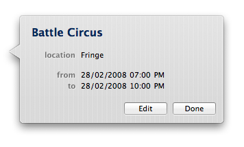
Squint, and you’ll see ‘em. Here, this might help; they’re pretty subtle:
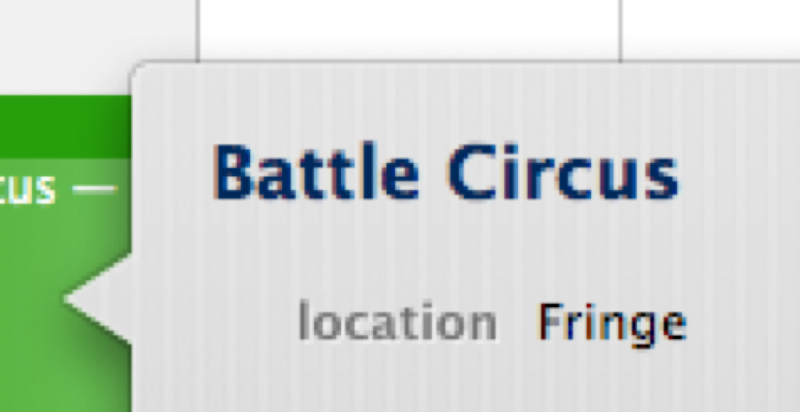
Vertical slimming lines in an otherwise unadorned window. And they’re lighter than the window. Quite unexpected. I’ve only seen them here in iCal, too. Do I like them? Well, I guess I’d rather not have them there. Noticing them did prompt this entire post, after all. But were they to be replaced with yet more gradient fills, I’d be more upset, I think. Too many gradients just kills me.
So there you have it. An insignificant graphical frill that will probably be never again seen in any Apple product, but one with enough back-story to make it worth mentioning. Perhaps.